This is a sponsored post by Andrew Roby and Myron Greer Landscape Design. All reviews and opinions expressed in this post are based on my personal view.
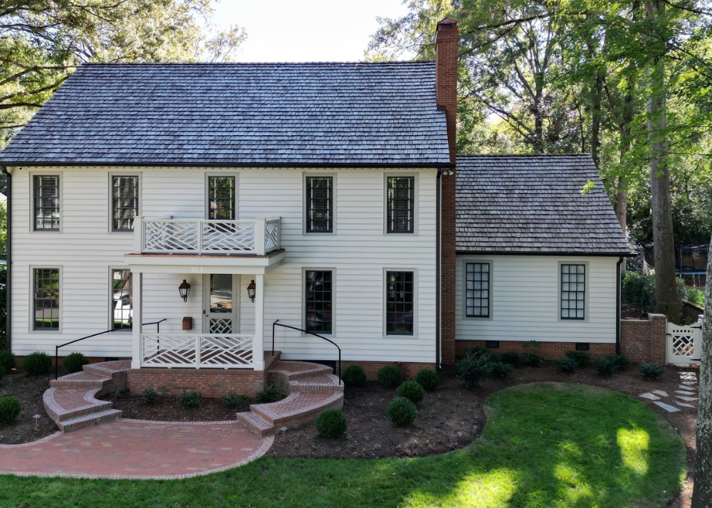
Paint Colors
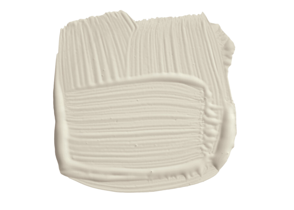
Siding: Farrow & Ball School House White No. 291
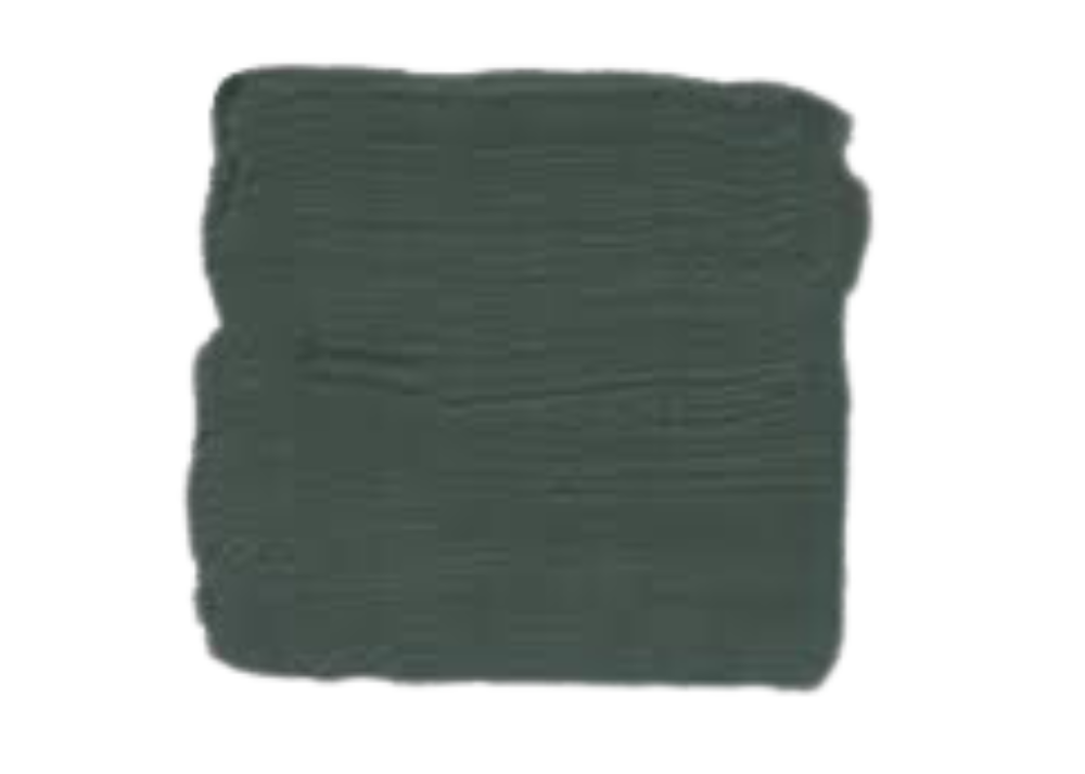
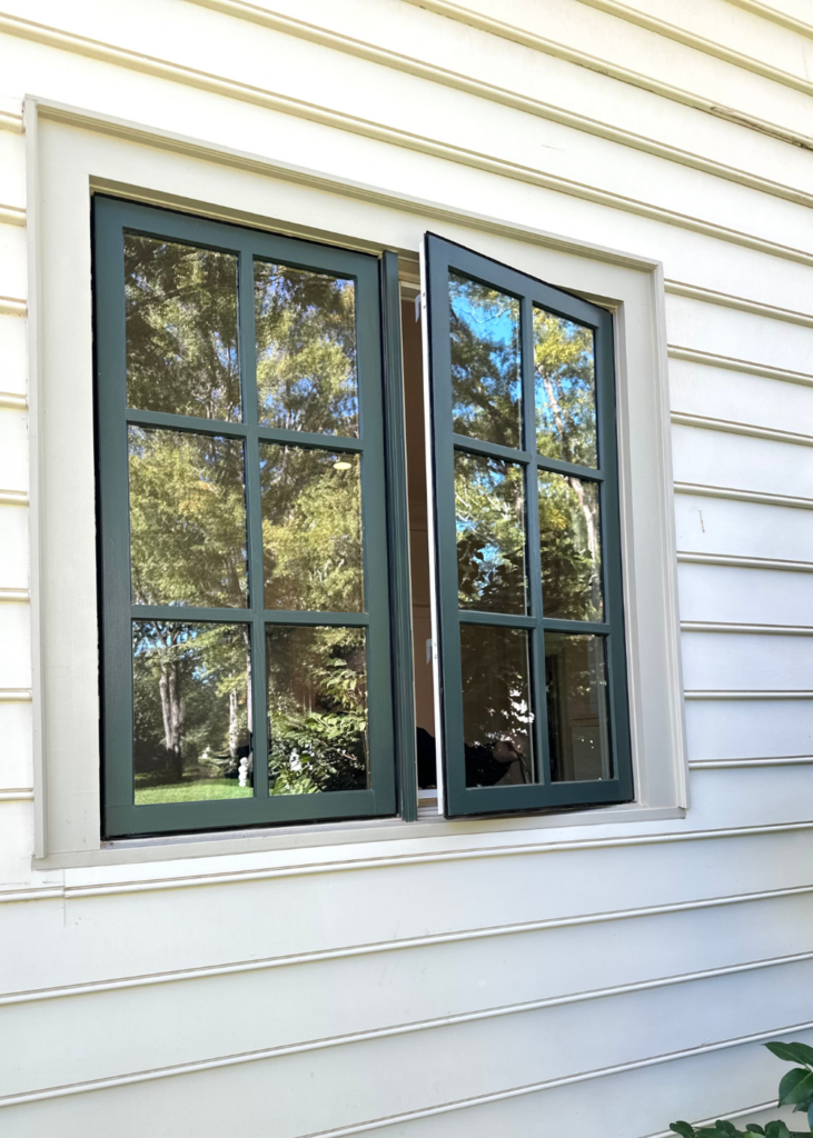
Trim: Farrow & Ball Carriage Green No. 94
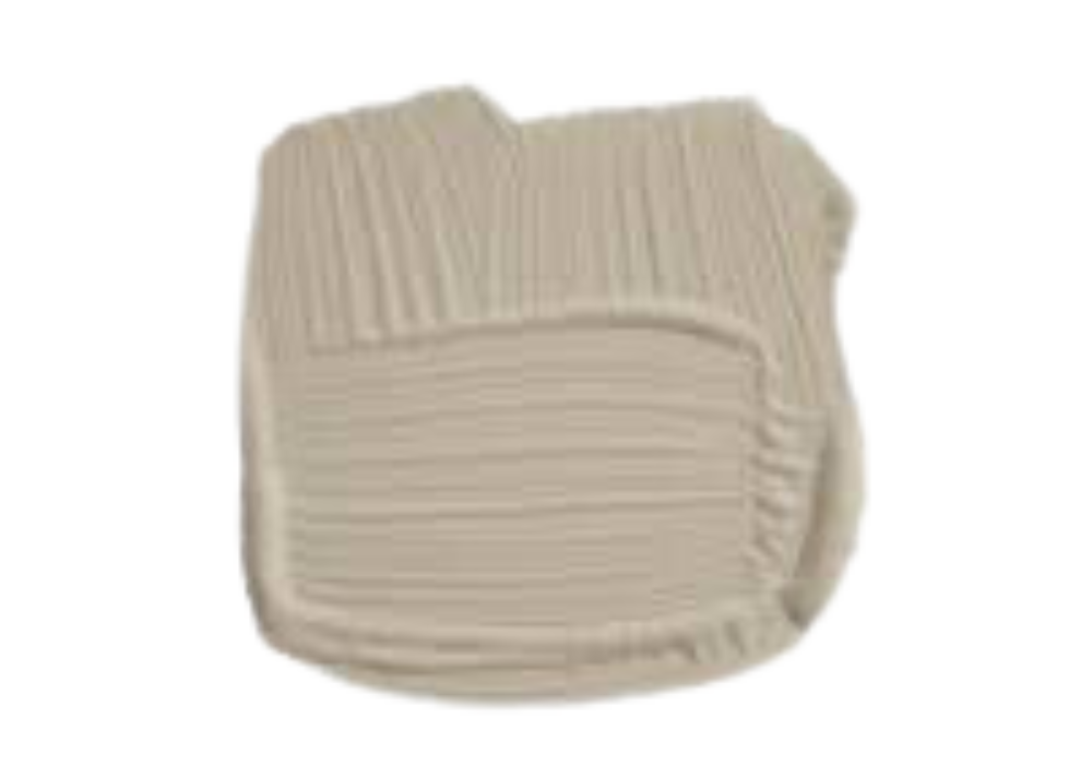
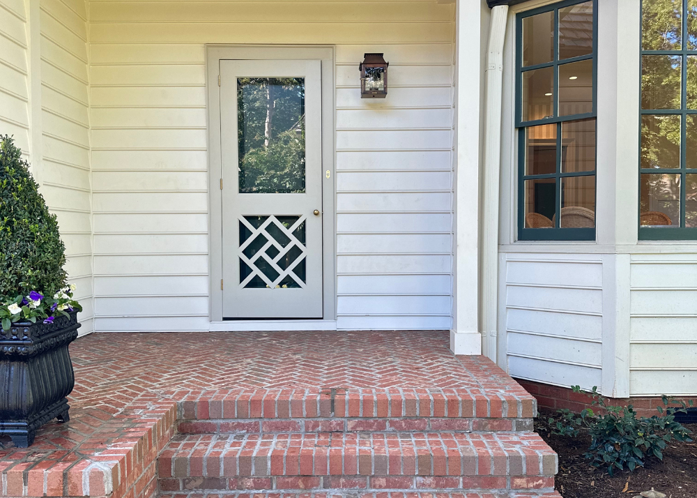
Front Door Color: Farrow & Ball Drop Cloth No. 283
Farrow & Ball paint and samples can be purchased at Celedore in Charlotte (they ship too). Email them at info@celedorewallpaper.com or call the store to place an order or make an appointment – (704) 817-8679.
Front door is custom designed by Mark Phelps and built by Queen City Lumber
When it was time to update the exterior of their dream home, Charlotte homeowners called builder, Andrew Roby, landscaper, Myron Greer, and designer, Mark Phelps. It was a dream team, if there ever was one, to transform their tired colonial into a graceful fixture in the neighborhood.
In one of Charlotte’s most beloved neighborhoods where children walk to school, neighbors stop and chat and home prices are some of the highest in Charlotte, sat a family home stuck in the 70’s ready for a new life.

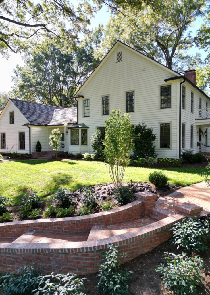
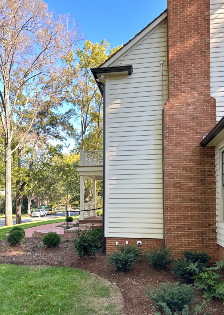
Designer Mark Phelps reimagined the exterior with a cedar shake roof, statement molding, and a new front porch with chippendale railing and copper accents. He leaned on the Andrew Roby team to execute the design and to add function and longevity in material selection and craftsmanship.
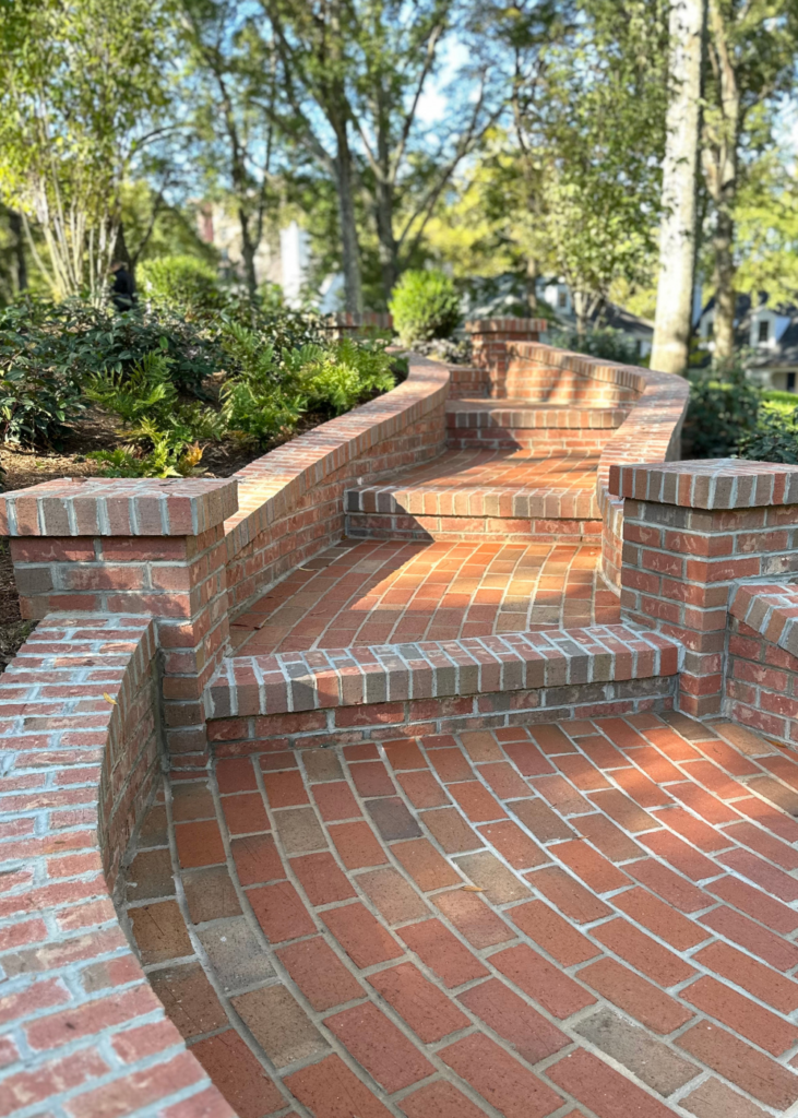
Landscaper, Myron Greer, designed a brand new park like entrance into the front entry that welcomed guest from the side street that is commonly used for street parking. The brick pathway is what first caught my eye on a walk several months ago when it was under construction.
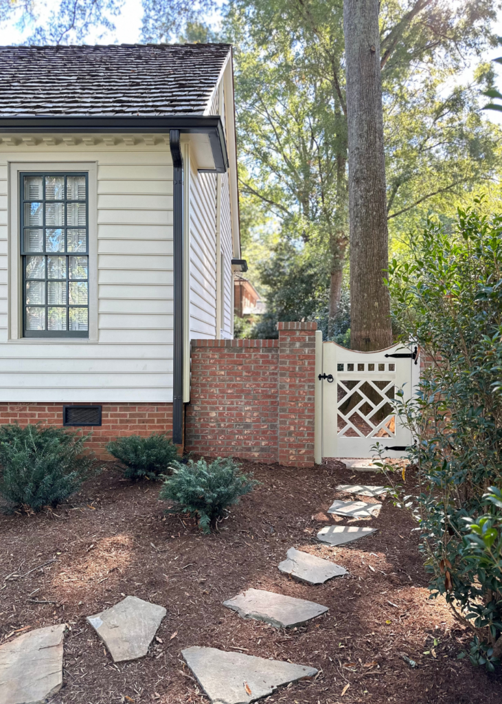
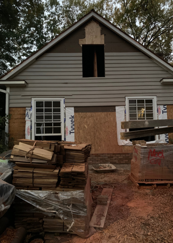
Before, the garage faced the street so it was flipped around to the back of the house and the side was rebuilt using original windows from the side of the garage where the garage doors are now. The goal was to make it look like it had always been there.
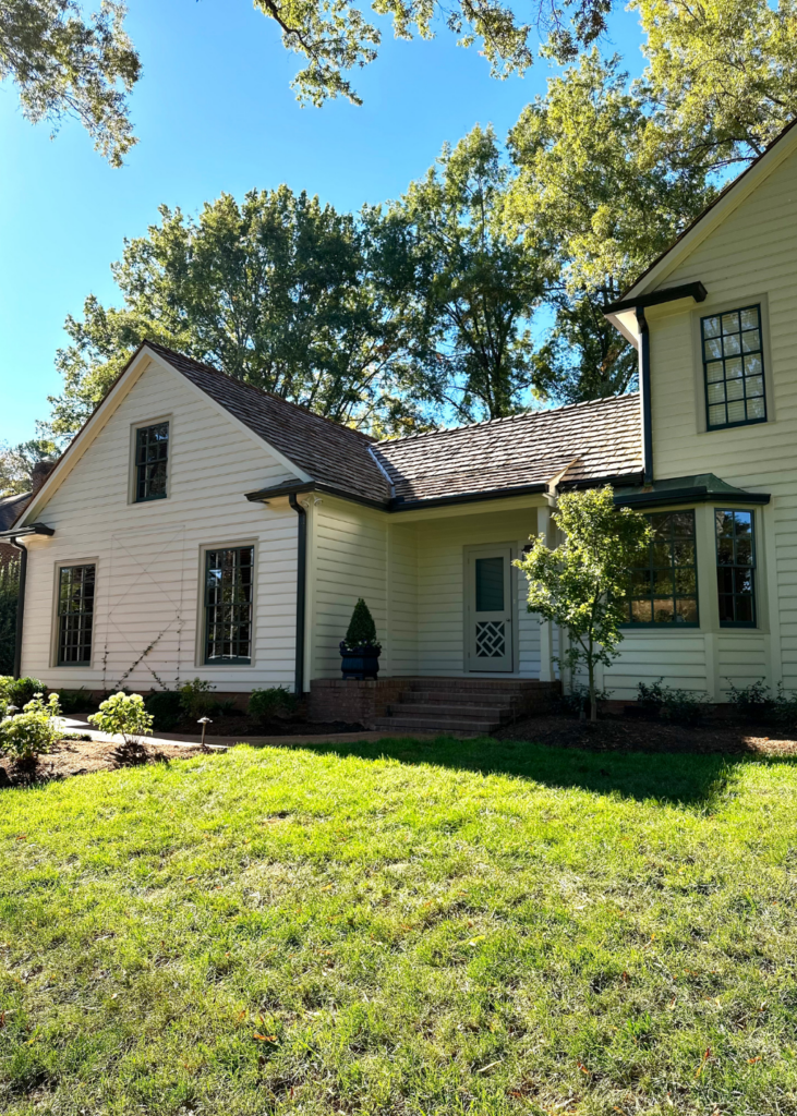
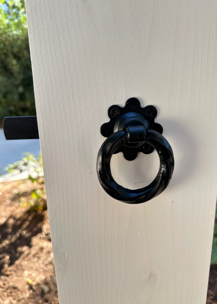
The home boasts two garden gates, two porch railings, a side entry door and front storm door with a similar fretwork design. The charm added by that simple touch is priceless.
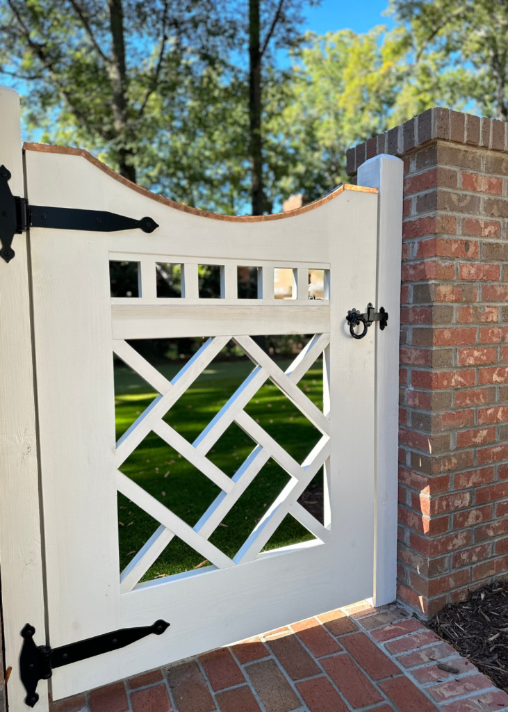
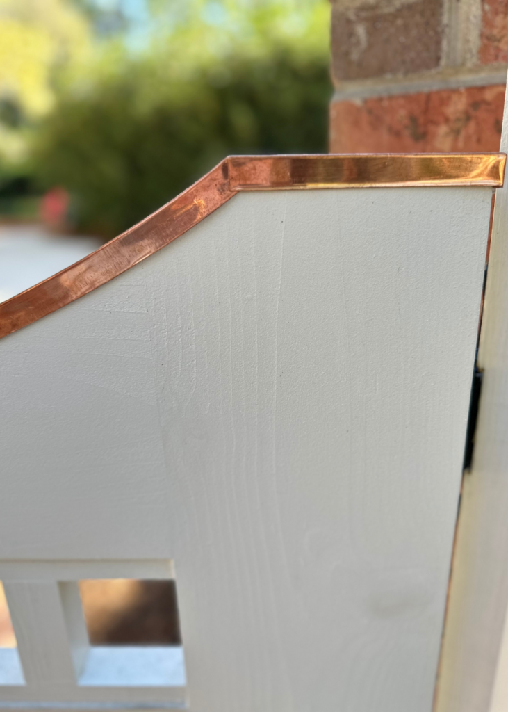
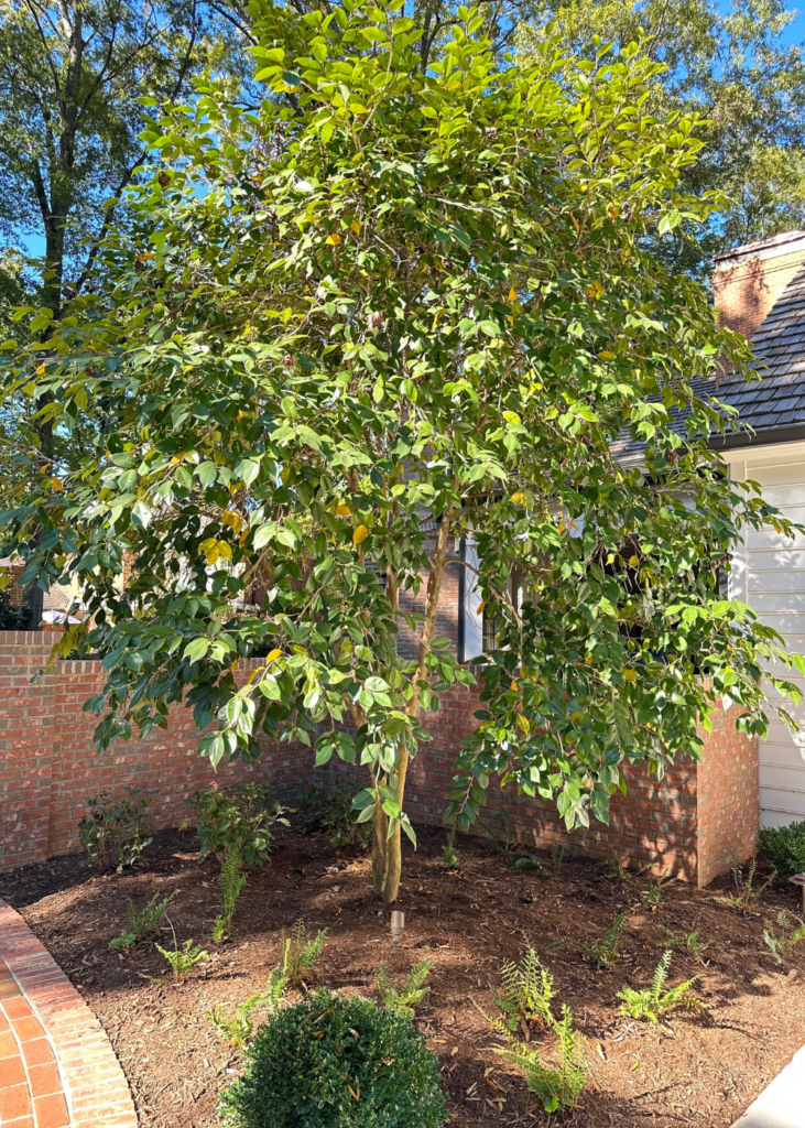
The landscaper, Myron, saved this tree by getting a root ball about 6 foot in diameter and transported it in the coolest part of the season to this spot. It’s tilted slightly towards the garden gate to add a little privacy and make it look like it has always been there.
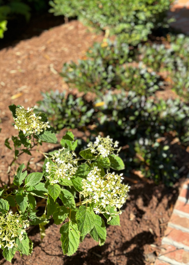
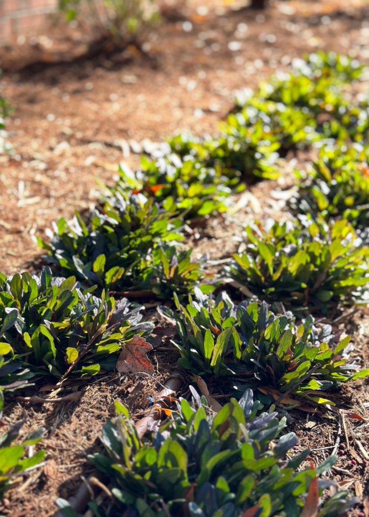
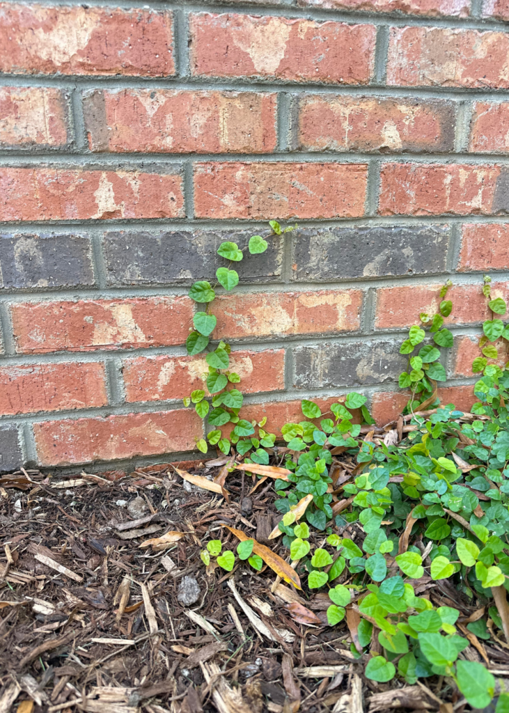
To keep with the style of the home and the traditional nature of the homeowner, Myron selected classic plant material like dogwoods, viburnum, native ferns, boxwoods, camellias and hydrangeas. He chose a Korean variety in Winter Green for the boxwoods which are less susceptible to the boxwood blight affecting American boxwoods.
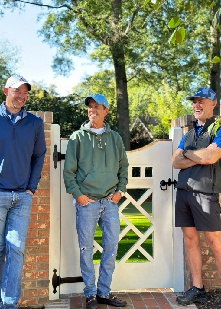
Chris (left) served as the Andrew Roby Project Manager, Mark Phelps (center) was the designer for the project, and Myron Greer was the garden and landscape designer. According to the homeowner, they each brought ideas and skills to the project and worked together to implement the plan seamlessly. I had so much fun talking with them and learning about the home through their eyes. It truly was a dream team that made the entire experience a joy for the homeowner!
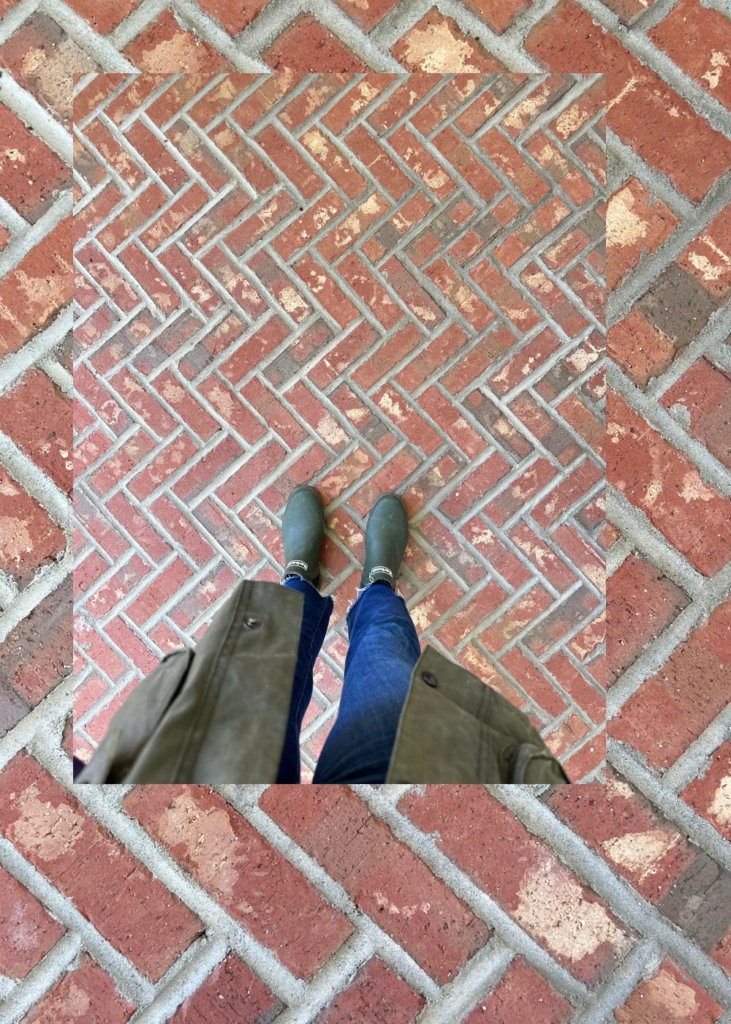
I loved the herringbone pattern of the brick on the side porch.
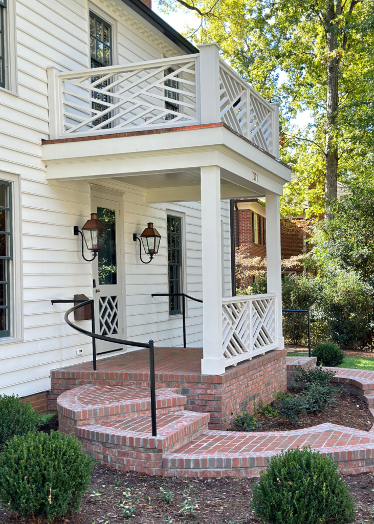
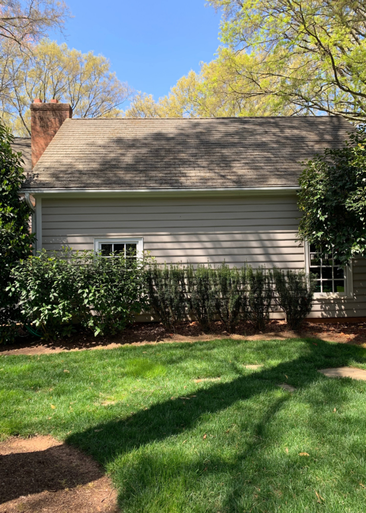
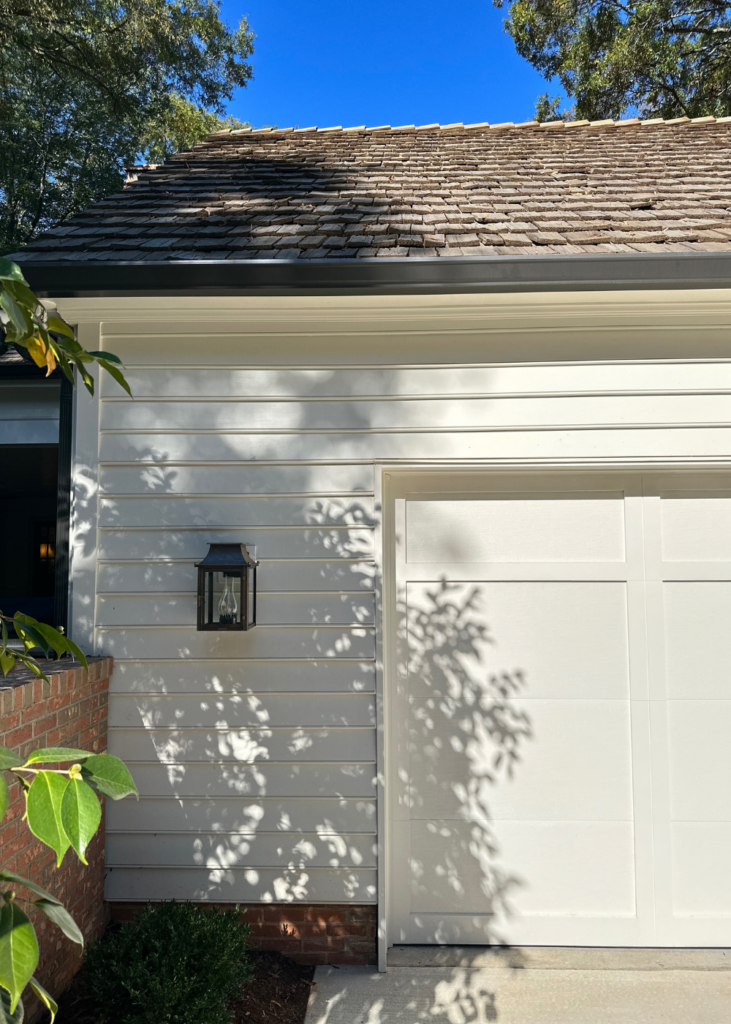
The before picture shows the two windows preserved and used on the side of the home during the remodel. The new cedar shake roof and paint make such a difference! The exterior lighting is from Bevolo Gas and Electric Lights.
I love a cranking window over the kitchen sink. The homeowner, Susan, said it’s a detail she never thought of but it’s something they use all the time and love!
Thanks for stopping by and hope you enjoyed this before and after story as much as I did! For more on this home, head over to the Garden & Grace Instagram.

