When my husband and I bought our 1965 home, we knew the bathrooms would need to be updated. The kid’s bathrooms are original to the home! The sink height was much lower at that time so the sinks have been a great height for the kids but are way overdue for an update. See images below of the original red sinks.
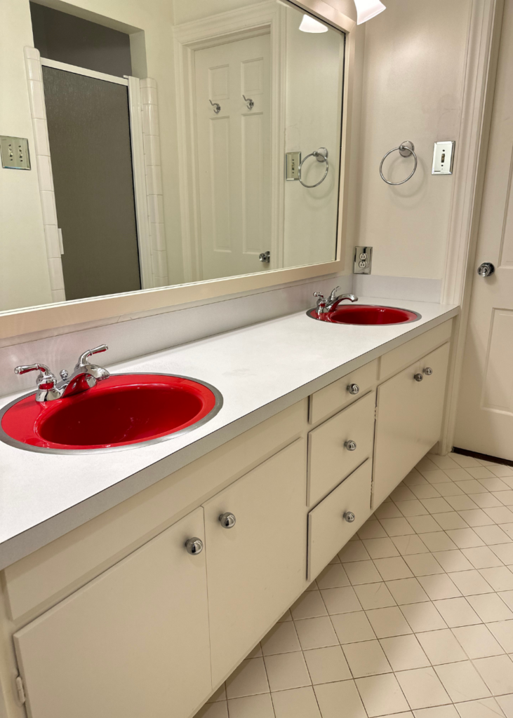
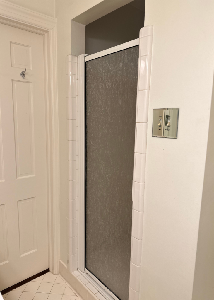
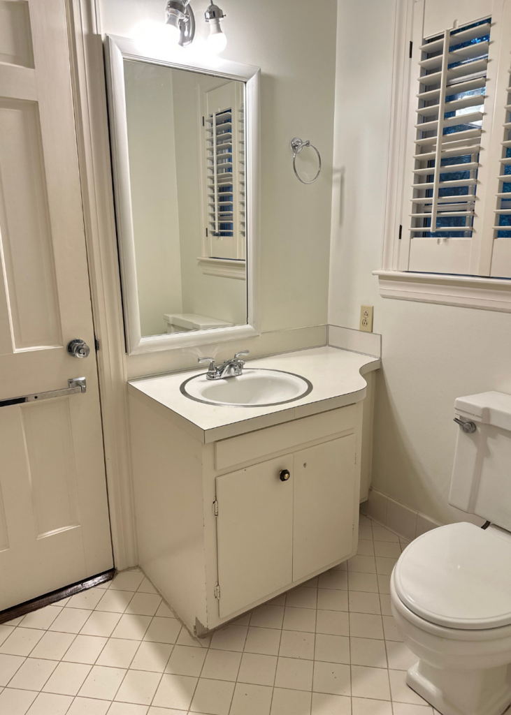
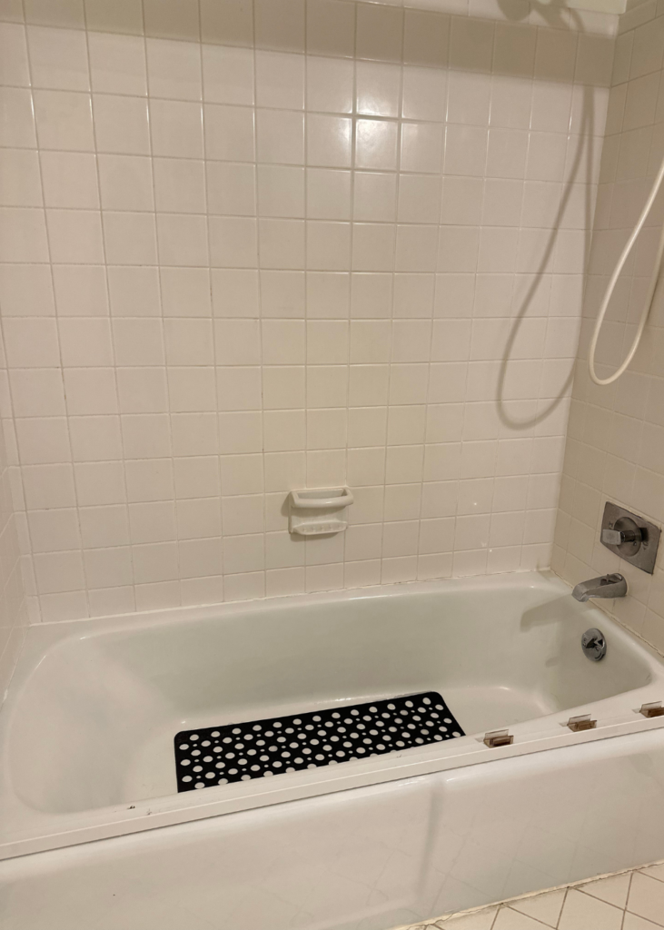
It’s time to give the bathrooms an update but I want to keep the style timeless and elegant. The primary bathroom will be more sophisticated but I would still like the kid’s bathrooms to be timeless and something they can grow into. I’ve been studying bathroom tile, cabinets, layout and plumbing fixtures for a few weeks now and want to share what I’ve found.
Once the renovations are complete, I’ll share the entire before and after process – the good, the bad and the ugly. For now, here are some bathrooms that are giving me ideas and inspiration for a fresh, yet traditional look.
Admittedly, these images are from Pinterest which can make it challenging to track down the original source. But I’m linking each image back to the Pinterest image to give the “Pinner” credit. If you want to see more bathroom inspiration, click on over to my Pinterest page and tap “Follow” so you’ll never miss a pin.
Before I jump into the kid’s bathrooms, I want to share my vision and inspiration for the primary bathroom. Renovations will start after the kid’s bathrooms are complete, but I’ve already started pulling together a plan and to say I’m excited is an understatement.
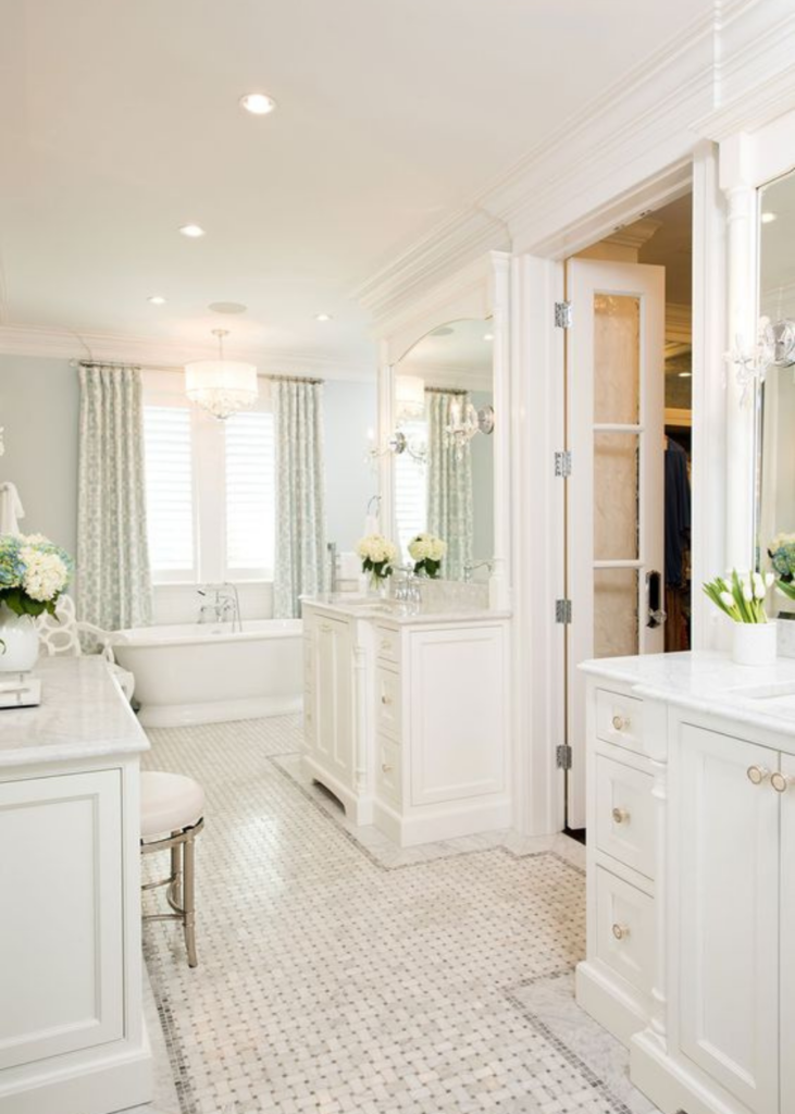
The above image caught my eye for a few reasons:
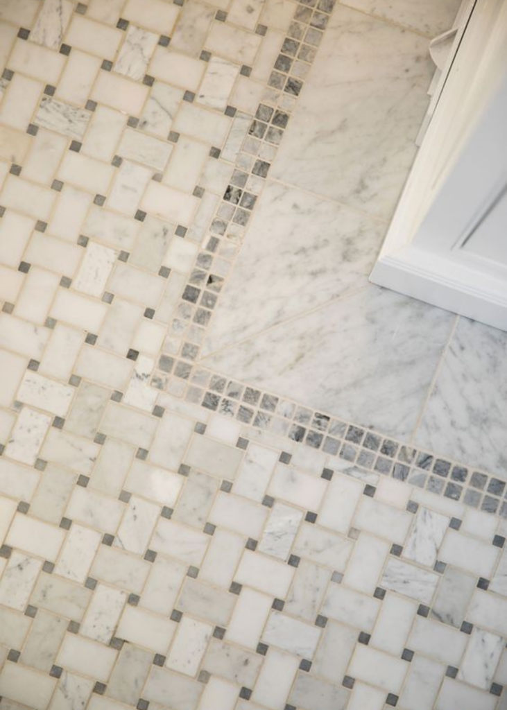
- The basketweave flooring with marble edging
- The thick crown molding ceiling trim
- The standalone tub with a traditional silhouette
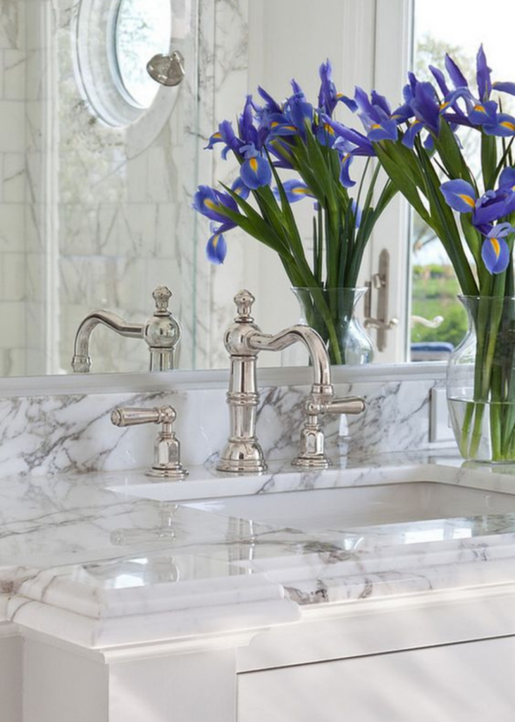
- The beveled edge marble countertop (it’s hard to see in this image but I’ve included others below)
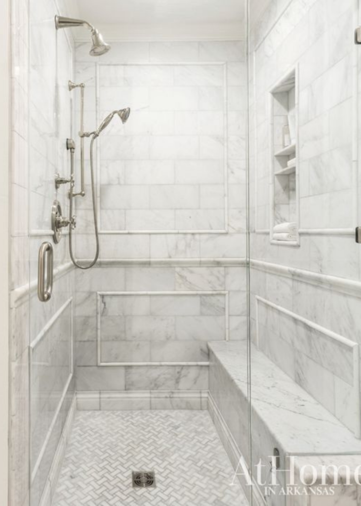
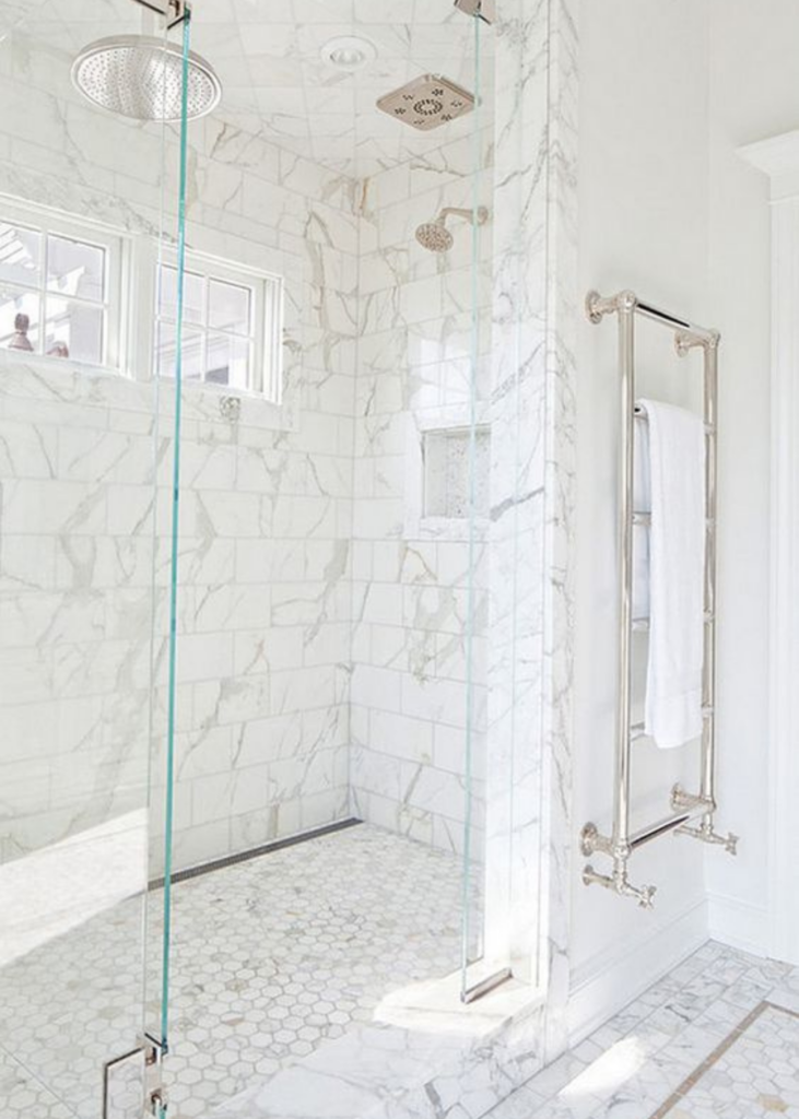
The basketweave marble floor is seen here again in the shower floor. I will likely carry the floor tile into the shower floor so this is inspiration for all flooring in the primary bathroom. And these shower walls! I’ve found that one way to elevate and create a more traditional look in a shower is by adding a thin pencil liner trim in a shape that mirrors the shower wall. I love the way this one turned out.
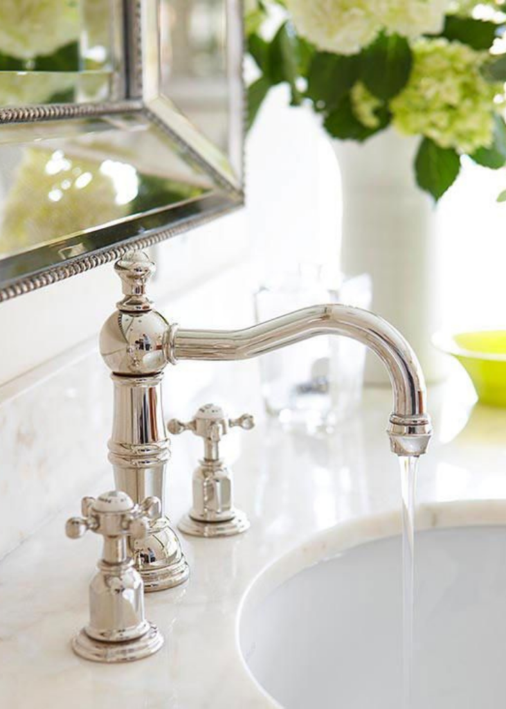
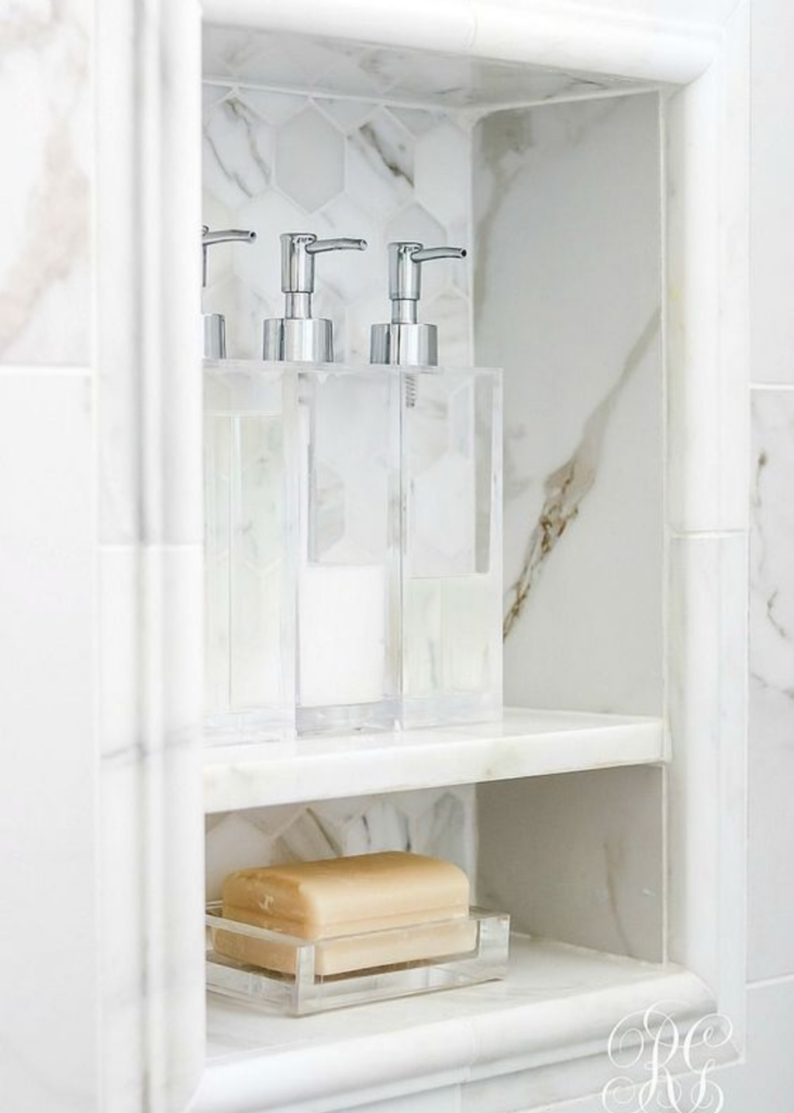
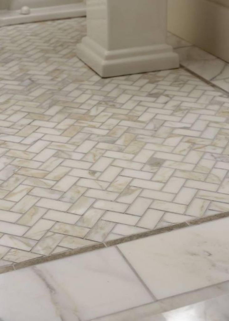
And below are lots of little details that shouldn’t be missed! The recessed shower niche is so important. We’re considering adding a few to provide ample storage. The last image shows a closeup of the beveled edge marble, and I love the elongated faucet in the image too. We are going to use cross handle faucets but most faucets come with an option to do cross handle or lever handle style.
I saved this picture above because of the lighting and ceiling. Have you ever thought about whether there’s a recess light in your shower? I hadn’t! But now that I’m remodeling, it’s something I’m thinking about for our shower and the kids bathrooms. If you pay attention at luxury hotels or resorts, you’ll notice a recess light inside the standup shower and above the tub area. Depending on your space, you may only need a 4 inch recess light. Standard is 6 inches.
Notice how the ceiling is tiled? After talking with our contractor, I’m opting not to add tile to the ceiling but will be taking the tile all the way up to the ceiling. We’ll be doing a shower head from the ceiling and a handheld shower system.
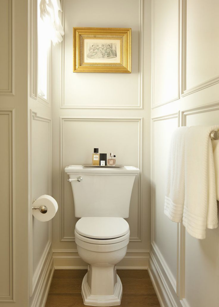
One of our big wishlist items for the primary bathroom is an enclosed toilet area or water closet. I love the trim work in this one and the toilet itself. I never thought I would care so much about a toilet until having to choose one for our own house.
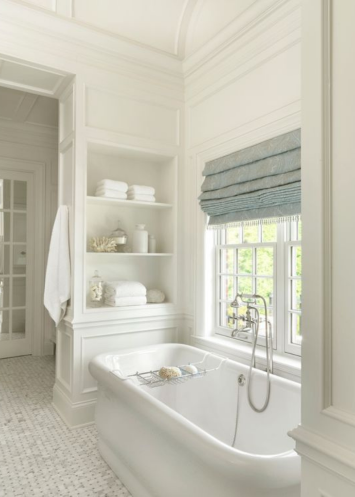
I saved this image for a few reasons too!
- The basketweave floor – again! I like seeing it in different spaces. This image helped confirm why I love it so much.
- The built in shelving with trim work – it adds so much charm to the room.
- The floor mounted tub filler with a handheld spray and cross knobs.
- The overall look and feel is high-end, charming and elegant!
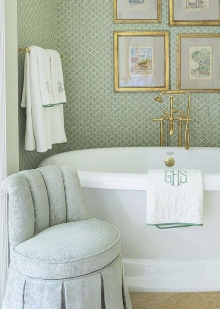
We’re not planning on doing wallpaper in our primary bathroom, but I just loved this green, gold and white palette here.
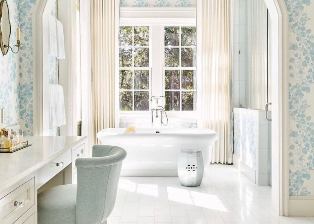
Again, not planning on wallpaper but how pretty is this blue and white wallpaper by Liz Williams Interiors!
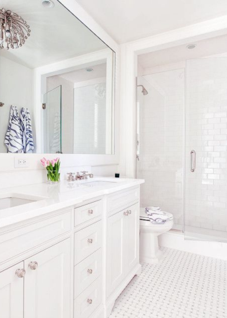
Let’s talk about the kids bathrooms now! To be honest, there are some similarities in the primary bathroom and the kids bathrooms – I want a classic look in all of the bathrooms. The image above has been my guiding inspiration for 4 reasons:
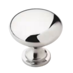
- The inset cabinets with nickel knobs.
- The basketweave floor with a blue/grey background.
- The subway tile shower wall which we will use in the shower wall and bathroom wall.
- The framed mirror that elongates the space.
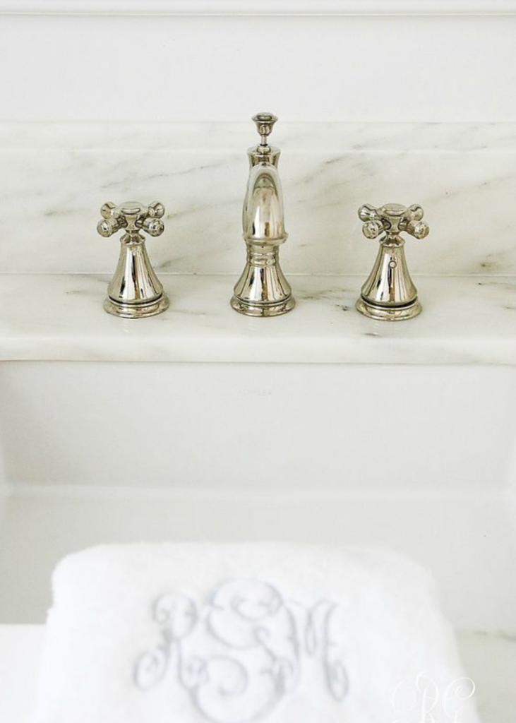
I love the simplicity and timelessness of this bathroom faucet. Notice the cross handles again.
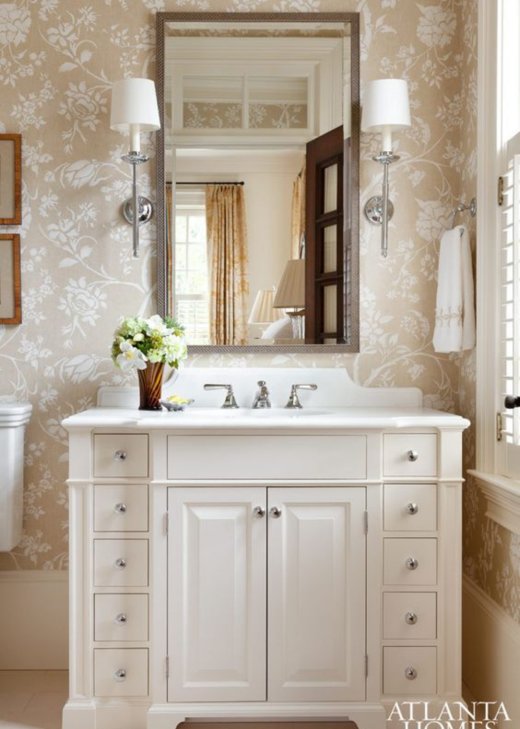
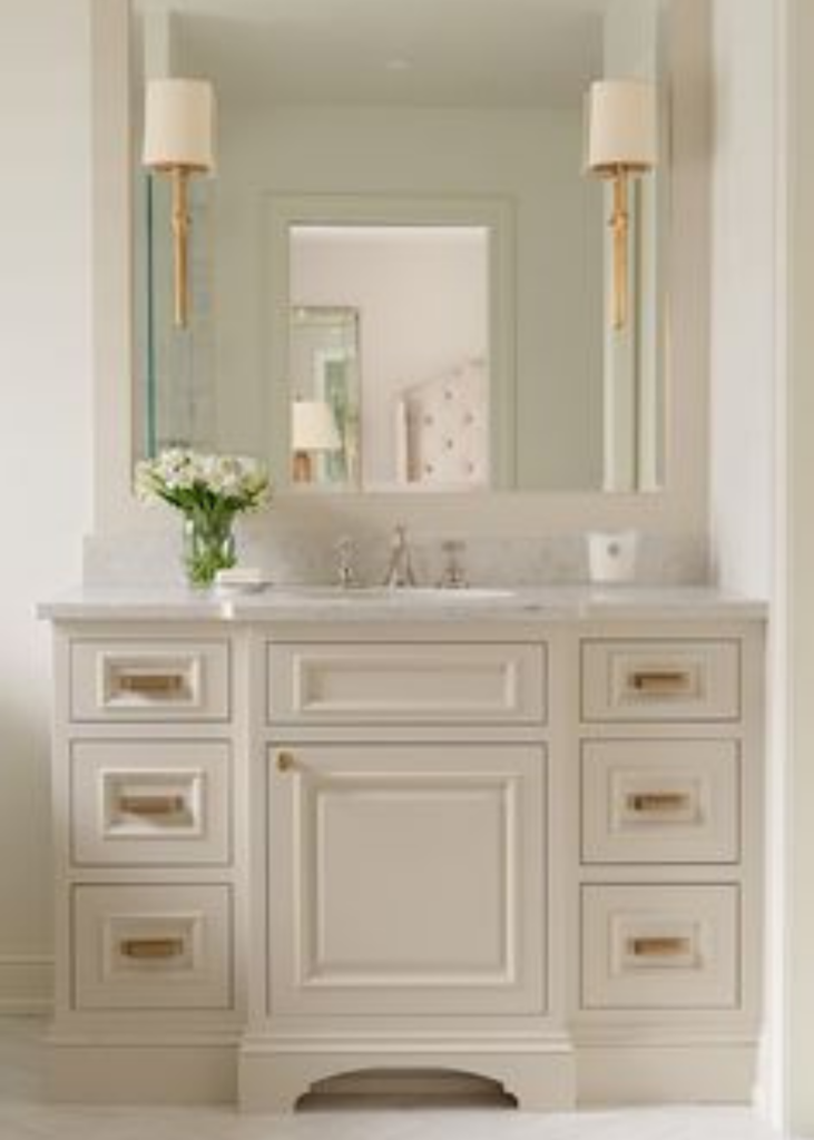
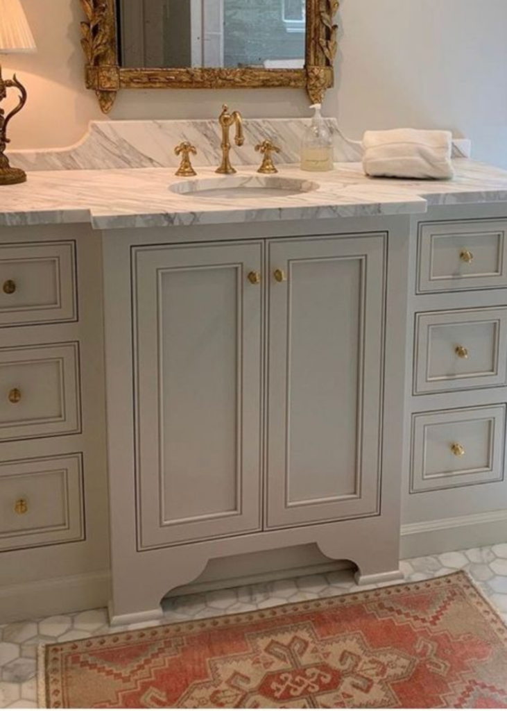
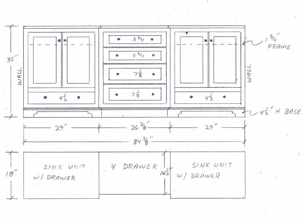
I saved the above image and the two below for the vanity style. We had the cabinets custom made since both bathrooms required unique measurements to fit the space. I also had some specific requests to make the bathrooms functional. In the boys bathroom the space was tight but I still wanted drawers.
The above image was what I used to show our cabinet maker to give him an example of very small width drawers flanking under sink cabinets. I used the bottom two images to think through options for ways to build out the middle cabinets under the sink.
This is what we ended up with, and I couldn’t be happier!
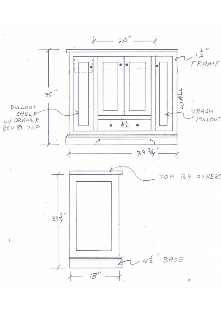
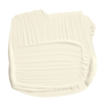
The first one is the double sink bathroom that my daughter will use and the second is the boy’s bathroom. Notice on the small vanity how a pullout trashcan was incorporated on the right pull out cabinet. Since the floor space is limited, I had that added so the room didn’t feel crowded. Both vanities will be painted Benjamin Moore White Dove.
Check back for more updates! In the meantime check out more photos and videos of our 1965 family home in the “My Home” highlight on Instagram.

